
What:
Rebrand focusing on visual identity and magazine print design
WHO:
Generasian, Asian American interest group and multimedia platform at NYU
CHALLENGE:
Break away from assumption that Generasian is specifically East-Asian-focused
Moving Away from Stereotypes
To give Generasian a new look that more accurately represented its work and audience, this rebranding turns away from the original, stereotypical ‘Asian’-looking, red and yellow design and taps into the larger story of the Asian American experience and the idea of intersectionality. While focusing primarily on Generasian’s bi-annual magazine, the rebranding features a new visual identity and print design.
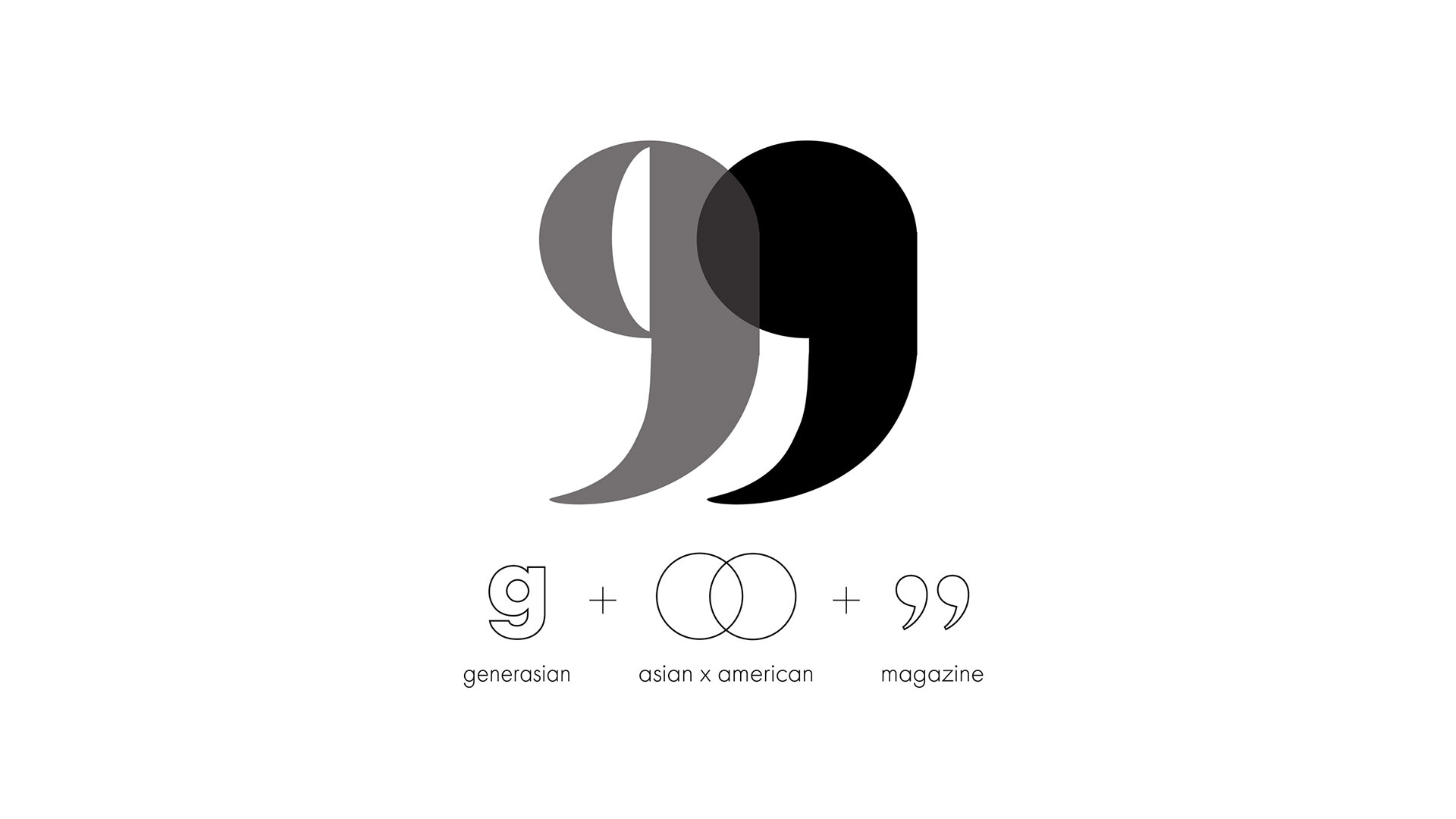
Logo design
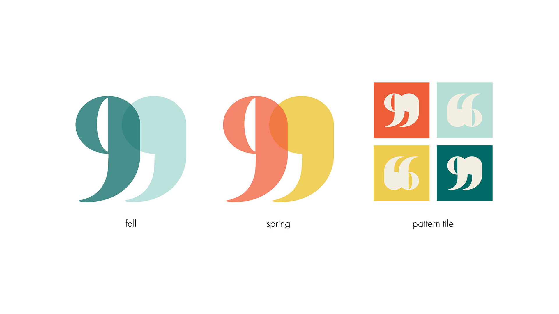
Logo variations for fall and spring editions, and a patter tile
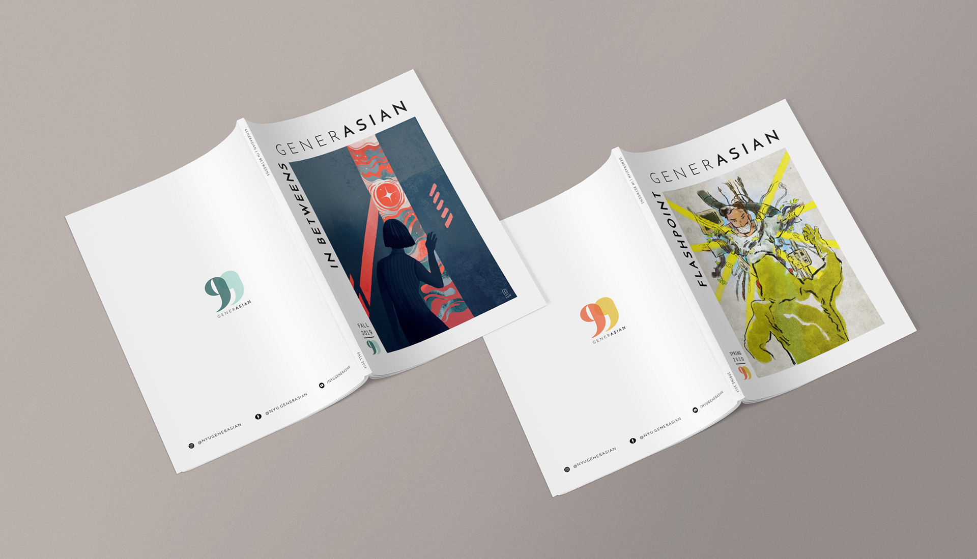
Mockup of fall and spring edition covers
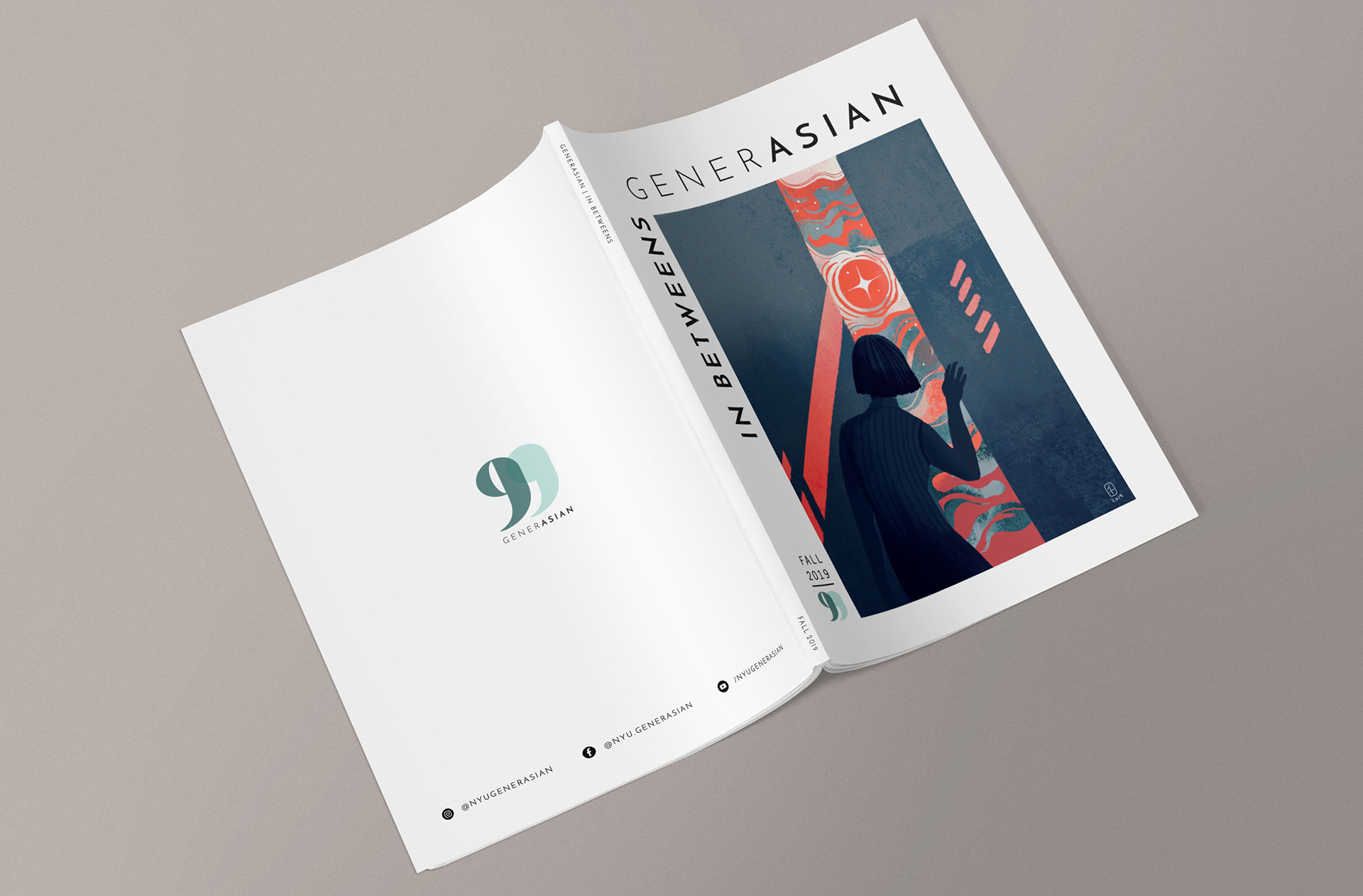
Closeup mockup of fall edition cover
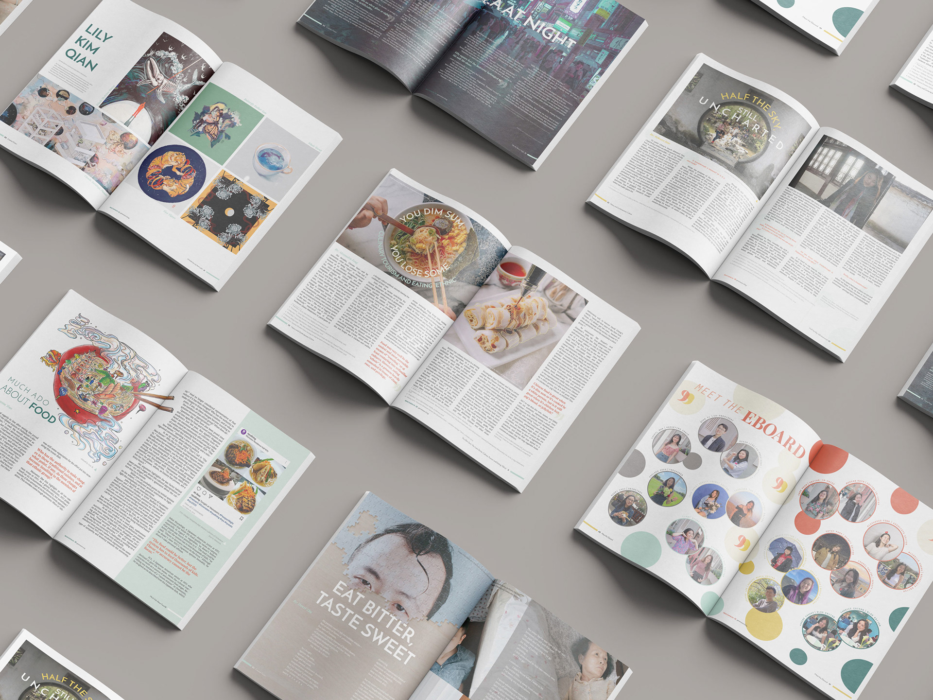
Mockup of page layouts